All Components
16 hand-crafted, copy-paste components built with React, Tailwind, and Motion.
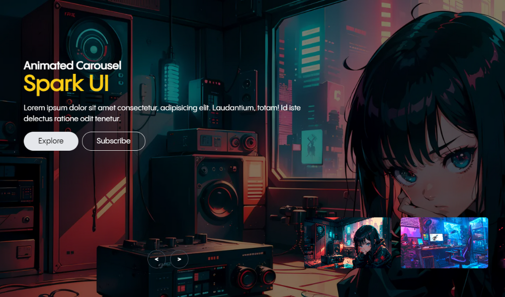
The Animated Carousel Component offers a visually engaging and dynamic way to showcase images or content in a rotating carousel format. Perfect for portfolios, galleries, or product displays, this component provides smooth transitions and rich interactivity, making it a standout feature on any website.

The Apple Preloader Component is a sleek and engaging UI element inspired by Apple's iconic design language. This component features a dynamic loading animation combined with rotating greeting messages in different languages, providing a welcoming and inclusive user experience.
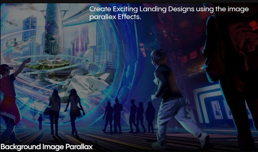
The Background Image Parallax Effect is a visually captivating UI feature that creates an illusion of depth and movement on a webpage. As users scroll through the content, the background images move at a slower pace compared to the foreground content, producing a stunning 3D-like effect. This technique enhances the user experience by adding a dynamic and engaging element to your website.
The Card Reveal Effect Component offers an immersive experience by mimicking a book-opening animation on hover. This component is designed to reveal additional information in a visually appealing way, ideal for story-based content or product details, providing a dynamic and engaging user experience.
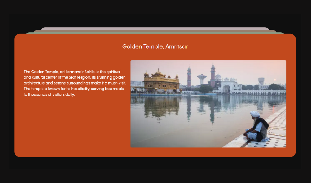
The Cards Stack Component is a visually engaging and interactive UI element designed to display a collection of cards in an overlapping, stacked format. This component enhances user interaction by allowing the cards to dynamically respond to user actions, creating a sense of depth and motion. Ideal for showcasing portfolios, product listings, or any content that benefits from a layered presentation.
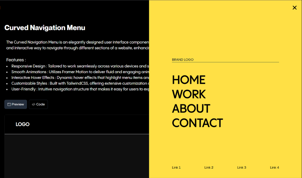
The Curved Navigation Menu is an elegantly designed user interface component built with React.js, TailwindCSS, and Framer Motion. This menu provides a smooth and interactive way to navigate through different sections of a website, enhancing the user experience with modern animations and a sleek curved design
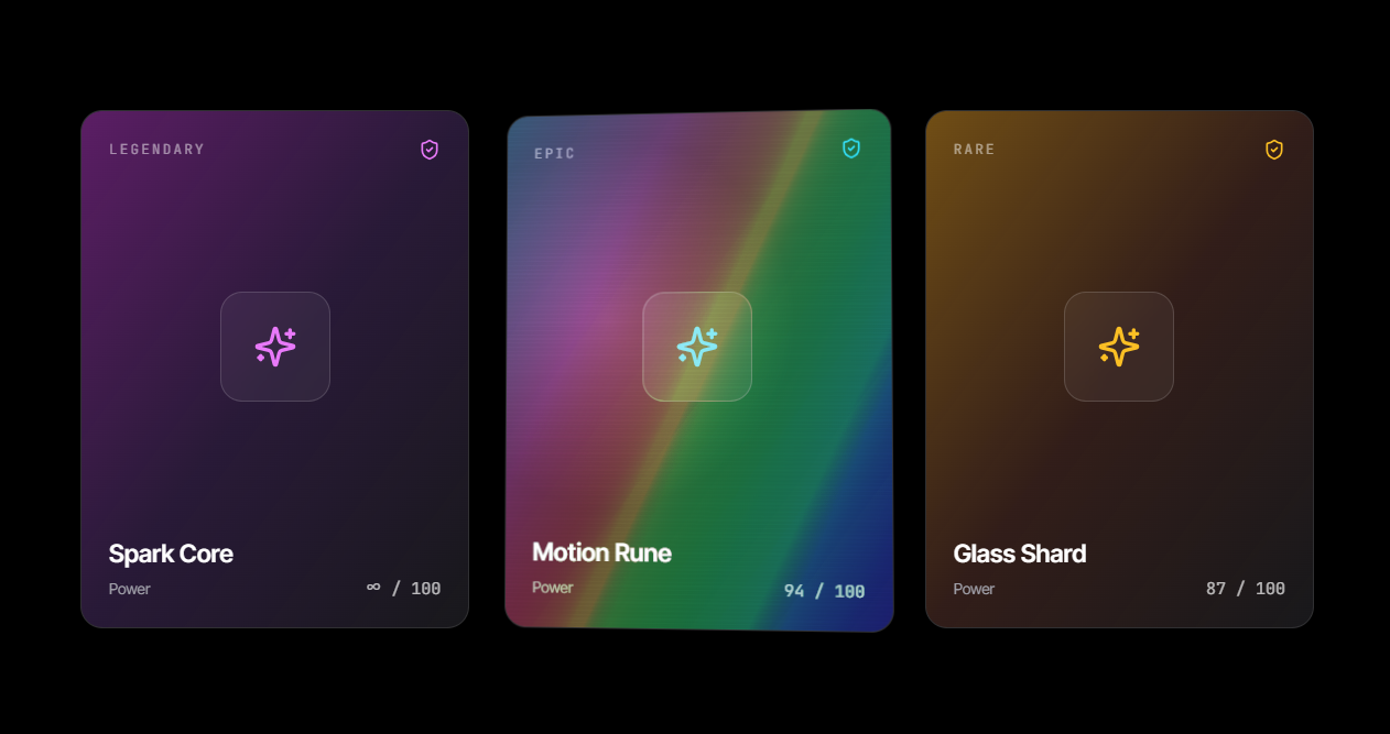
A trading-card-style hover effect: the card tilts toward your cursor in 3D, a rainbow foil sheen sweeps across it, and a soft glare follows your pointer — the same "holo" feel as a physical foil card, built entirely with CSS gradients and spring physics. Wrap any card content in it; no extra markup required.

The Image Slider Component is a captivating and user-friendly way to display a series of images with engaging animations. Ideal for portfolios, galleries, or product showcases, this component combines smooth transitions with interactive navigation, creating a visually stunning experience for users.
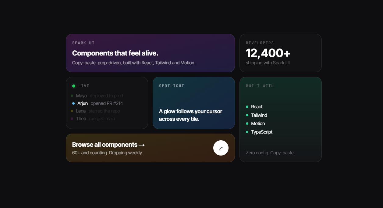
A modern bento-style layout that turns a simple grid into an experience. Each tile responds to the cursor — lifting gently, casting a soft spotlight, and leaning toward your pointer — so the whole section feels alive and premium. Mix large and small tiles to highlight what matters, and it reflows beautifully from desktop down to mobile.
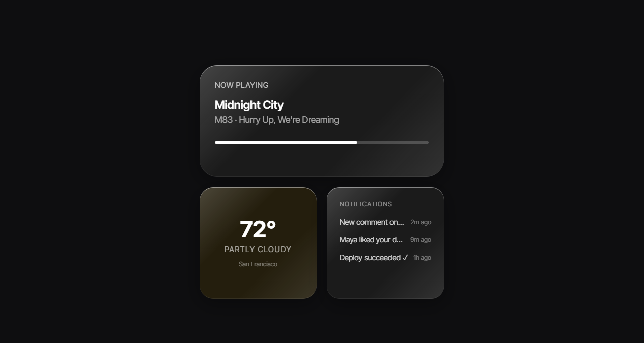
A glass morphism surface that wraps any content — text, images, buttons — and makes it look like it's sitting behind real glass. Tune the warp, blur, tint, and rounding via props to match your design without touching the source.
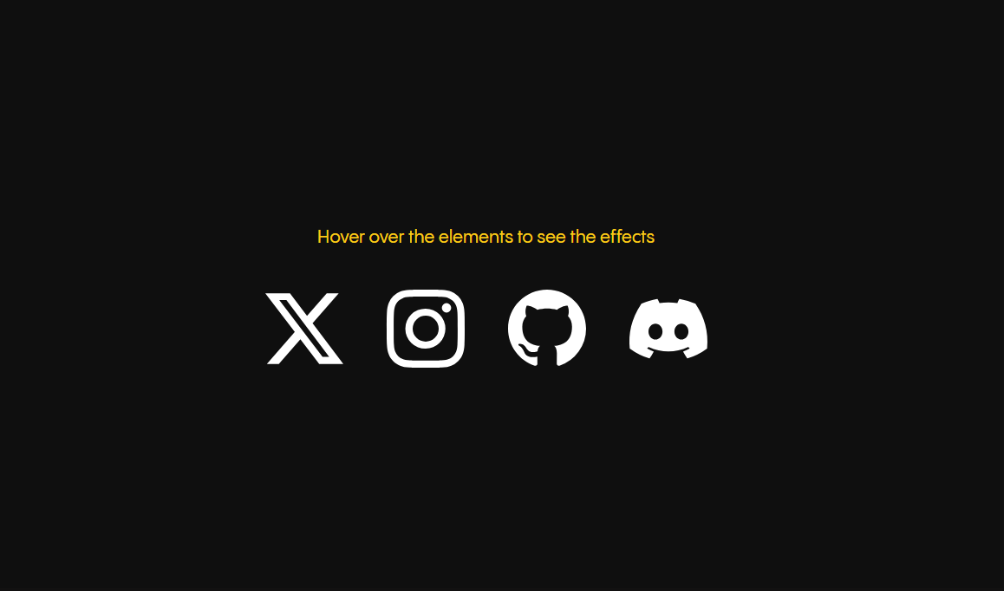
The Magnetic Effect Component is a dynamic and interactive UI element designed to enhance user engagement by creating a magnet-like attraction effect. As users move their cursor near the component, it smoothly follows the cursor, creating a captivating and fluid motion. This effect can add a playful and modern touch to various elements such as buttons, images, and cards, making them stand out and inviting users to interact.
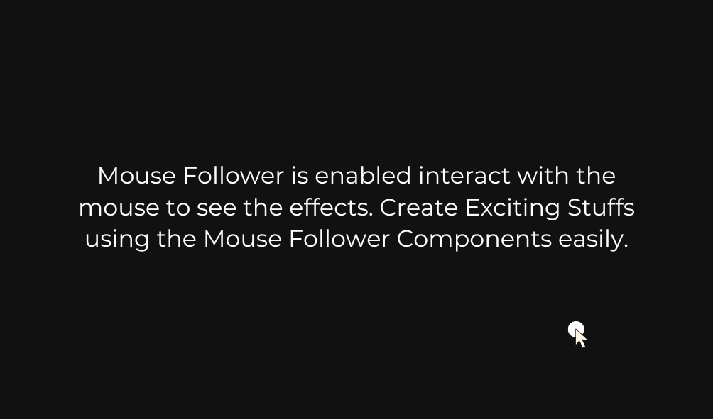
The Mouse Follower Element is a dynamic UI component that enhances user interaction by smoothly tracking and following the user's mouse movements across the screen. Built with React and Framer Motion, this element adds a modern and engaging effect to your website, providing a more interactive and visually appealing experience for users.
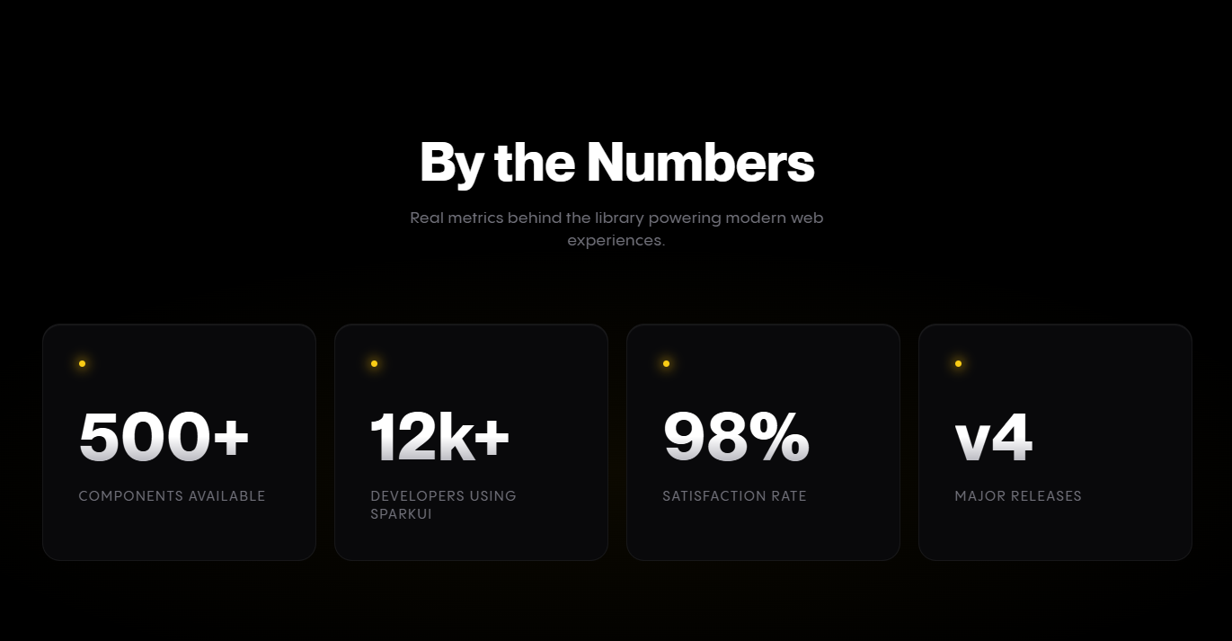
A scroll-triggered animated number counter that counts up from 0 to a target value using easeOutQuart easing. Supports automatic number formatting (12k, 1.5m), prefix/suffix, staggered entrance animations, and a glowing dot accent.
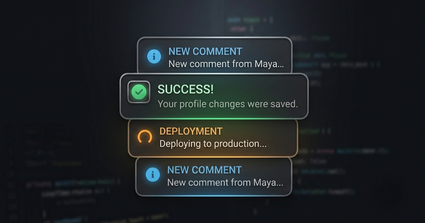
The Animated Carousel Component offers a visually engaging and dynamic way to showcase images or content in a rotating carousel format. Perfect for portfolios, galleries, or product displays, this component provides smooth transitions and rich interactivity, making it a standout feature on any website.
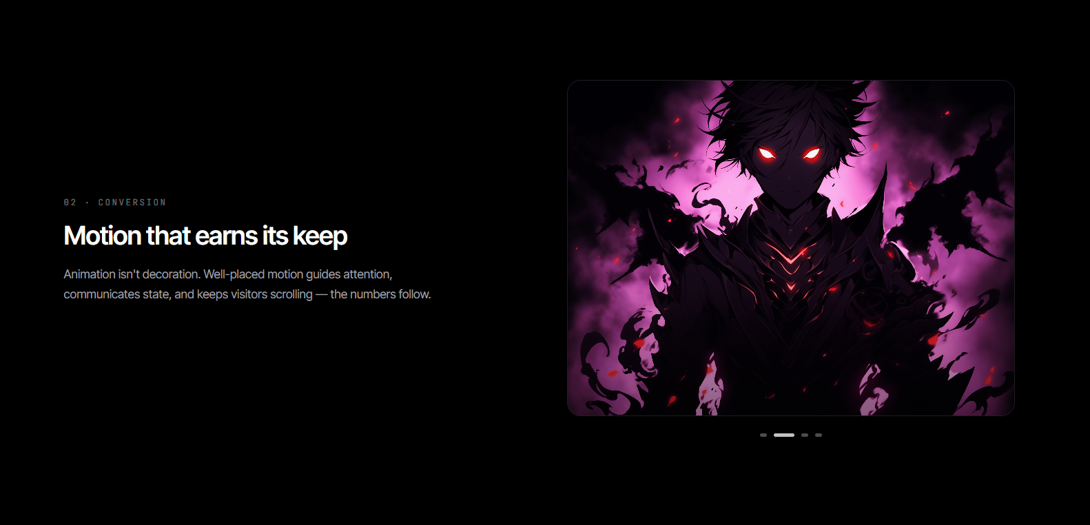
A scroll-driven storytelling section where your copy scrolls on one side while a sticky visual pane on the other swaps in sync. Pass any JSX — an image, a code block, a stat panel — as each item's visual; the pane crossfades between them as the matching section passes center screen
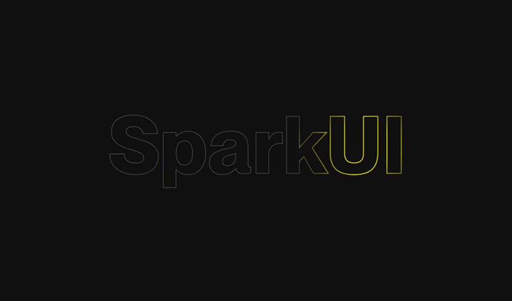
The Text Gradient On-Hover Effect is a visually striking UI feature that dynamically transforms the appearance of text when hovered over, applying a vibrant gradient effect. Built using modern web technologies, this effect enhances the visual appeal of your website, making text elements more engaging and interactive for users.